loading

Julius caesar

Client: H’ART Museum Amsterdam

Assignment: concept and 3d design for temporary exhibition

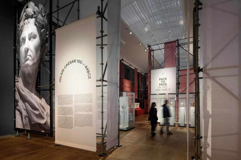
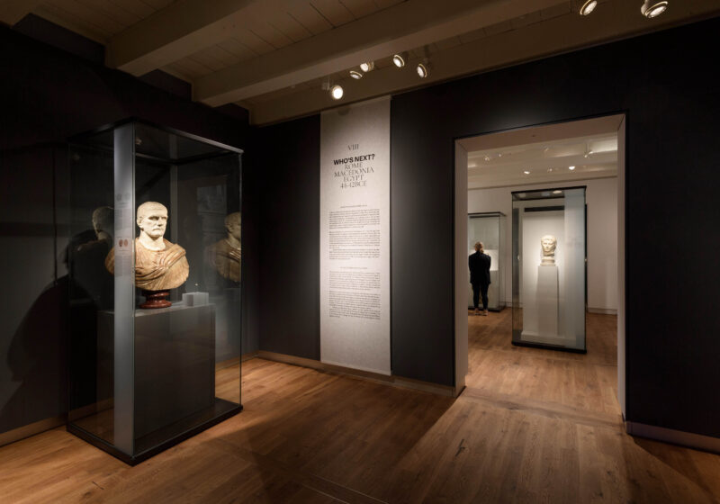
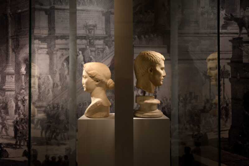
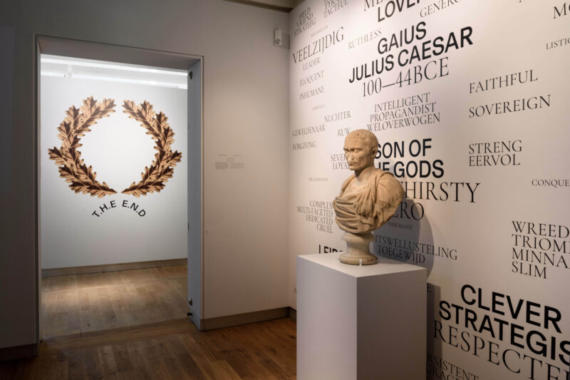
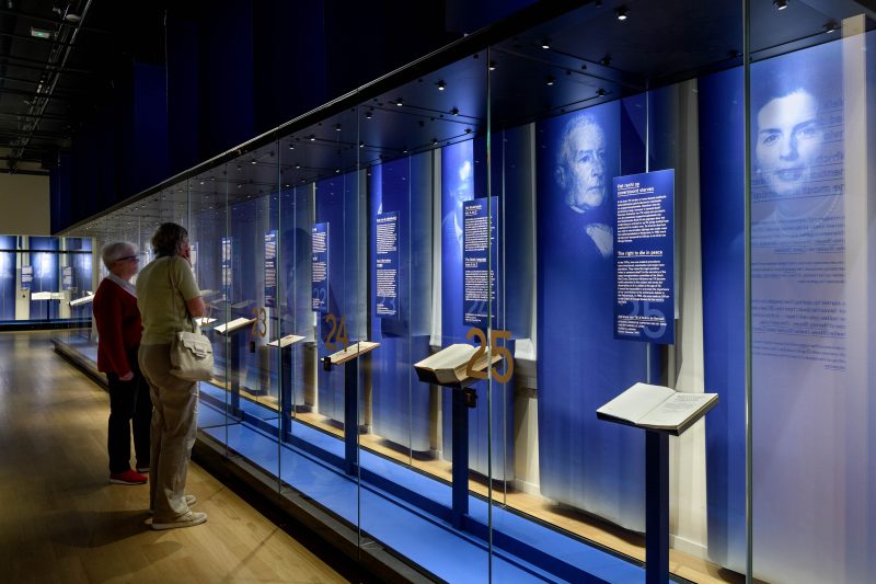
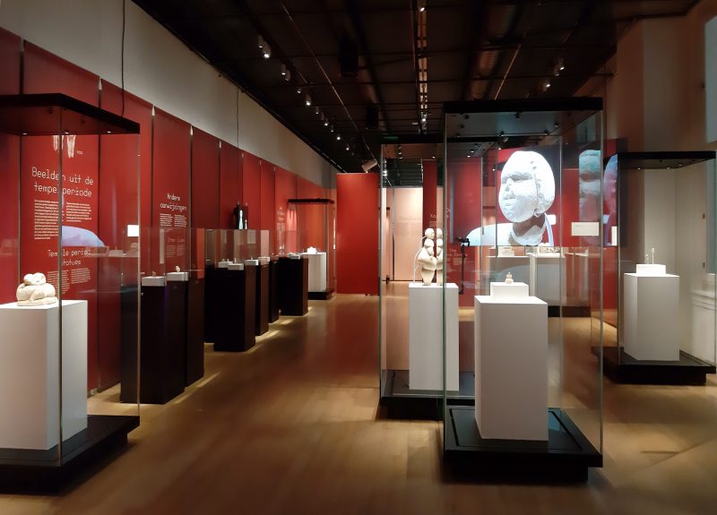
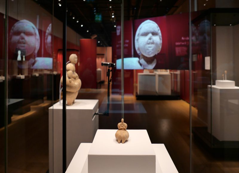
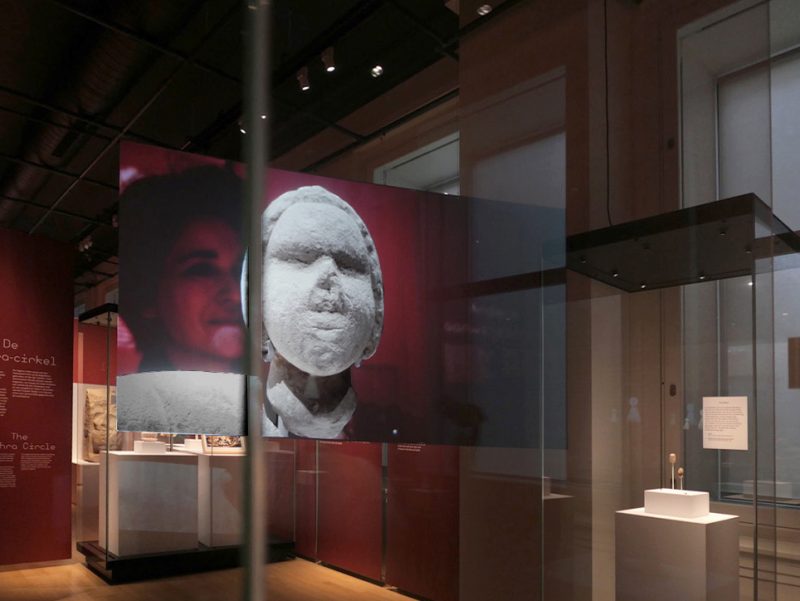
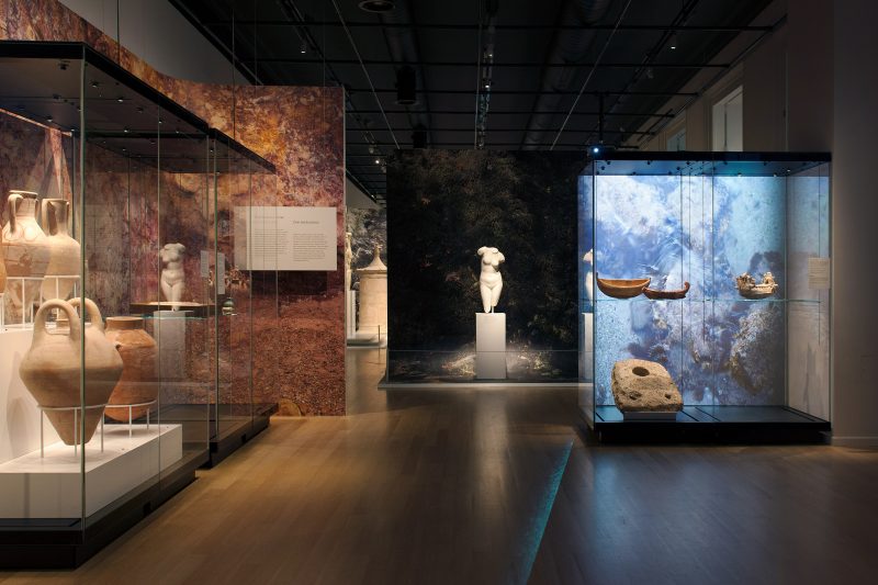
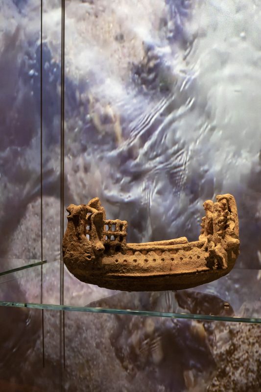
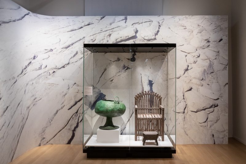
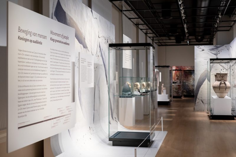
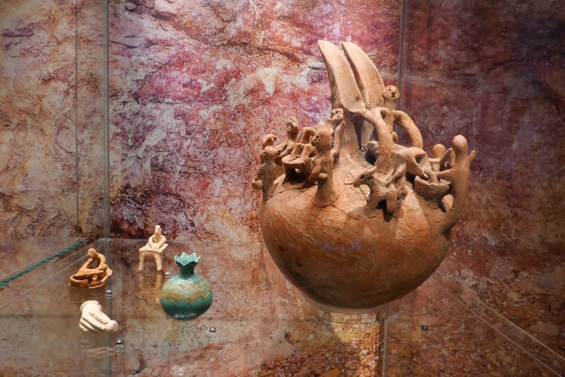
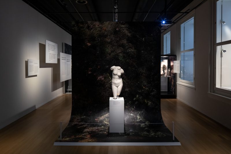
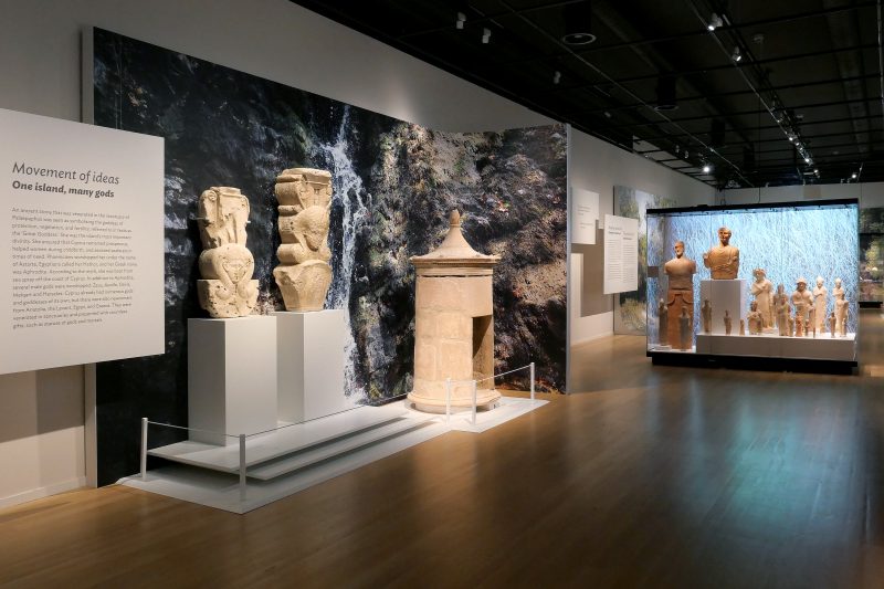
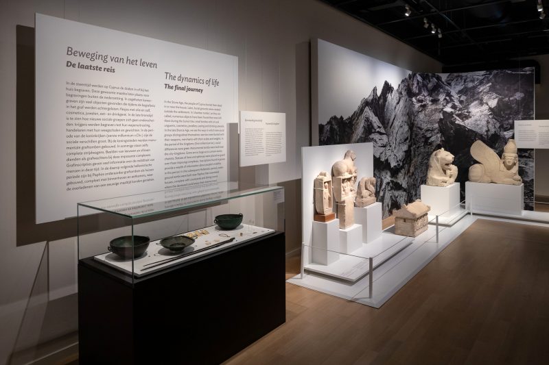
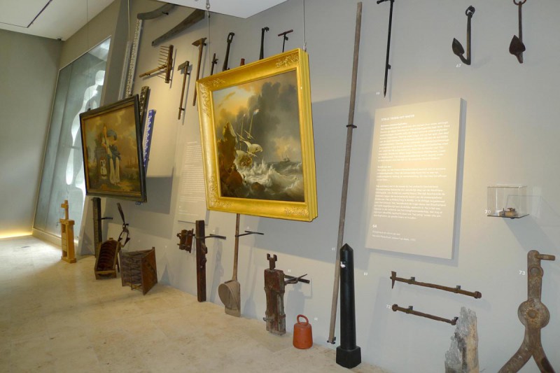
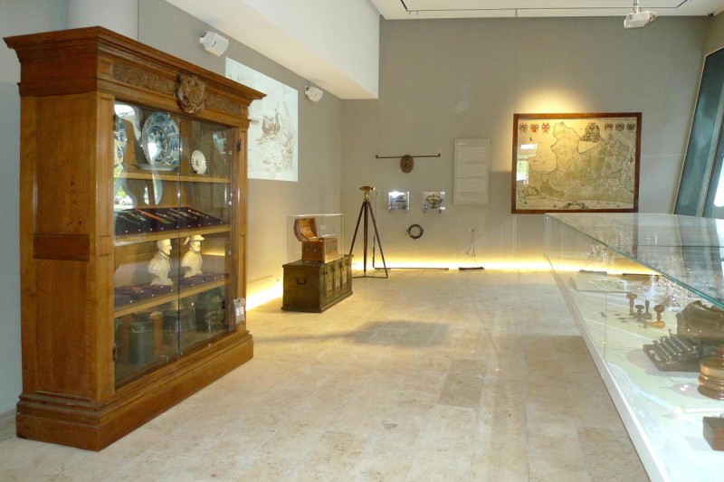
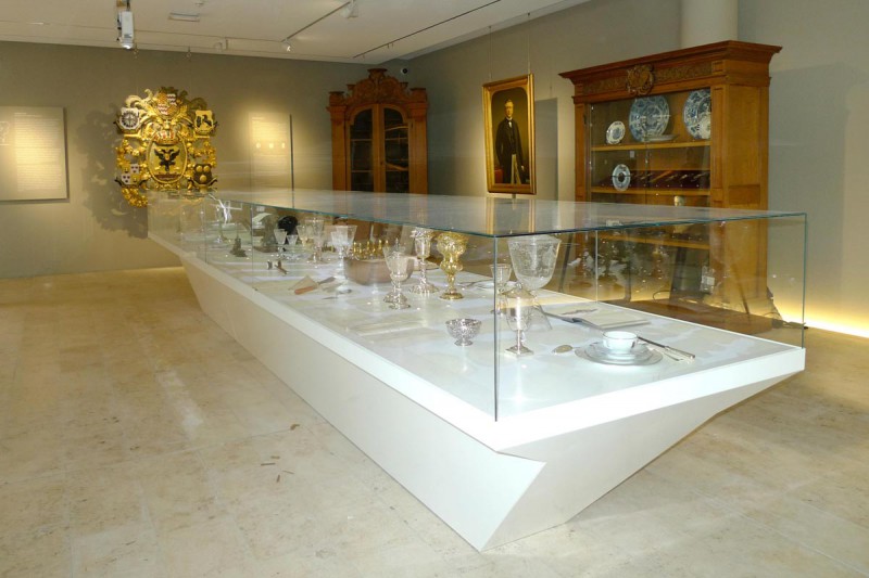
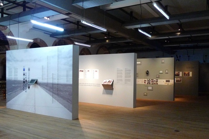
How should Julius Caesar – a white, male, dominant conqueror – be staged in today’s museum? The first exhibition in H’ART museum – formerly known as Hermitage Amsterdam – tries to unravel the myths and reality around Caesar, with its highlights and its dark sides.

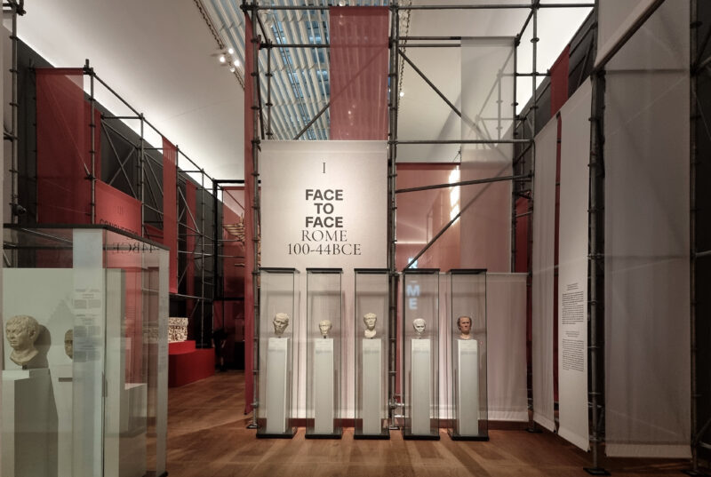
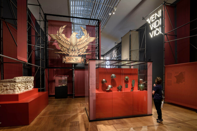
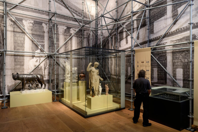
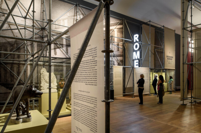
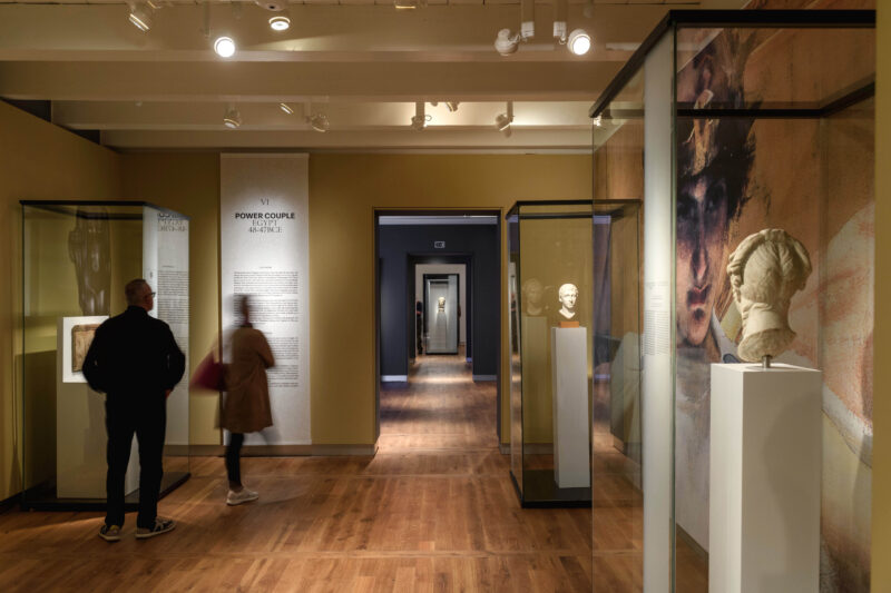
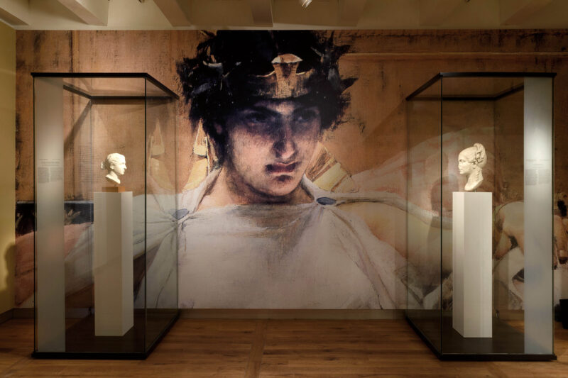
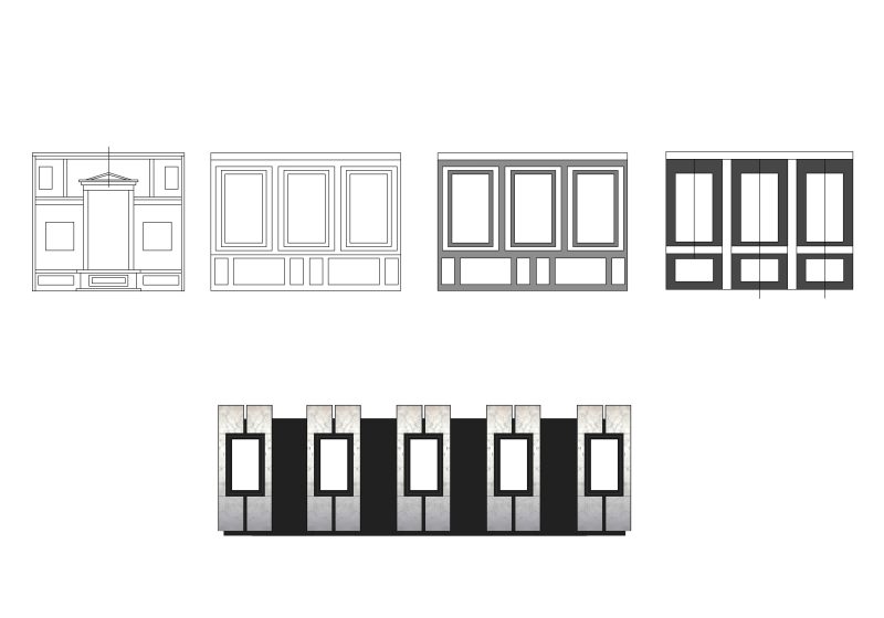
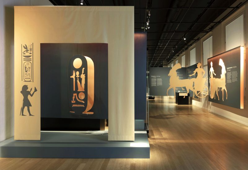
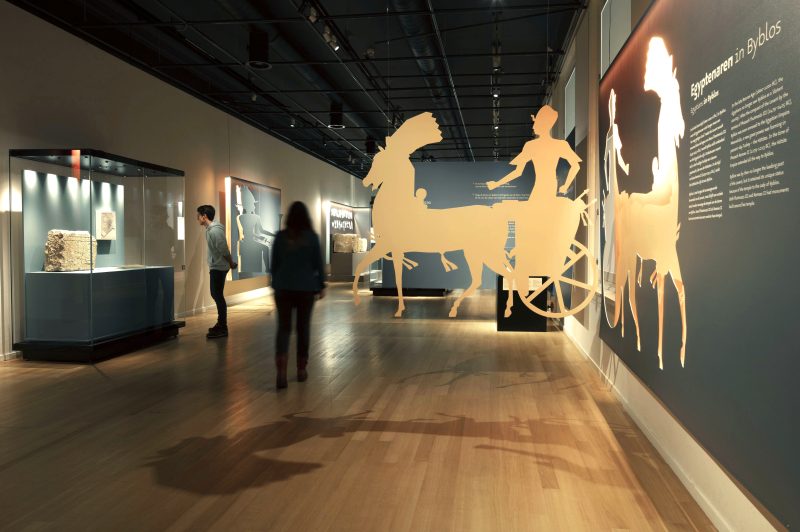
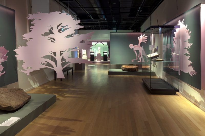
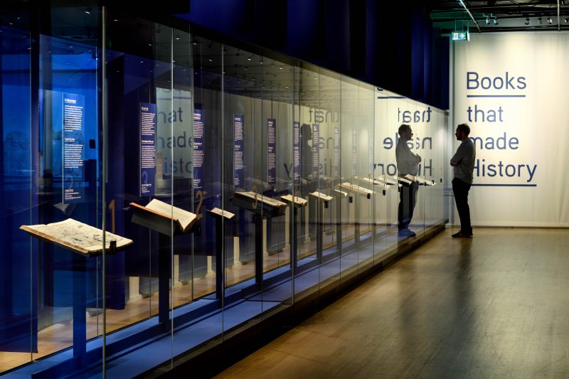
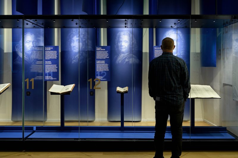
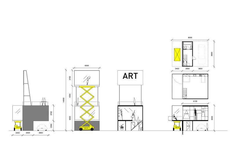
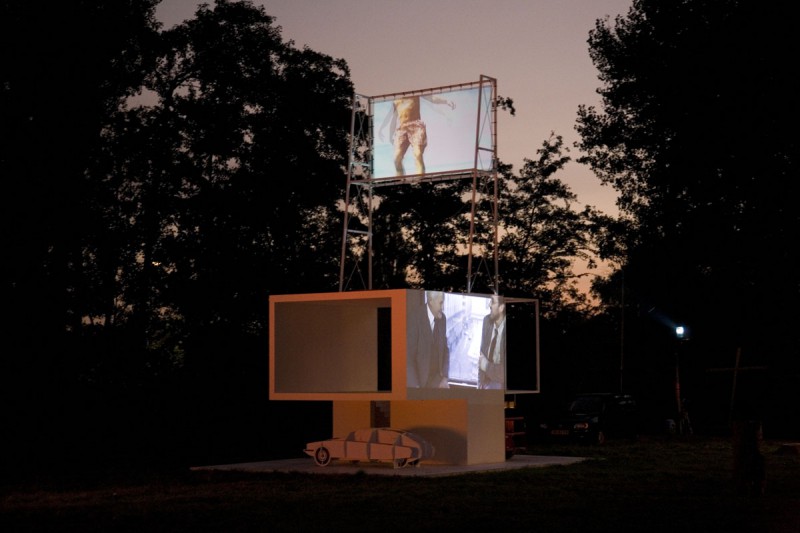
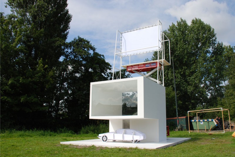
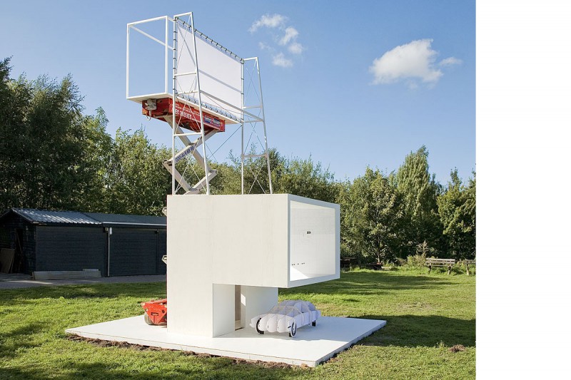
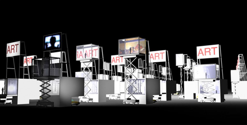
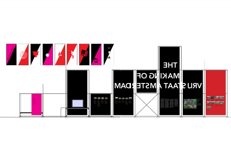
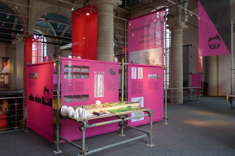
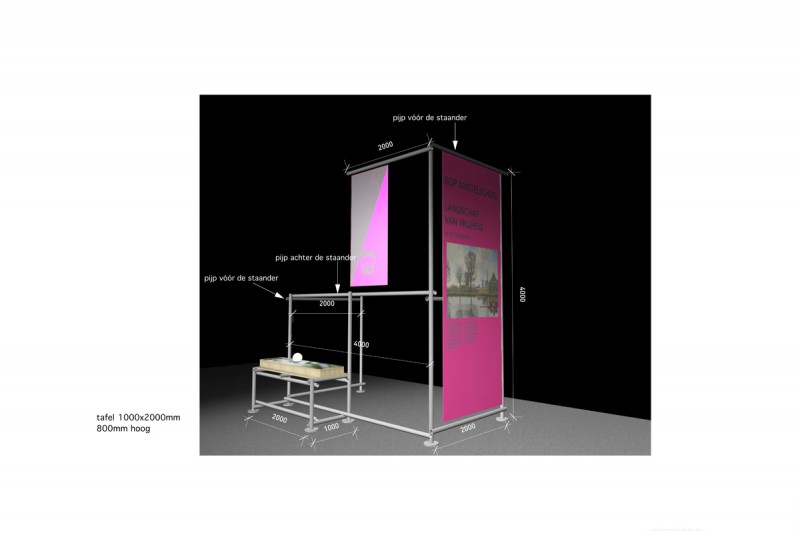
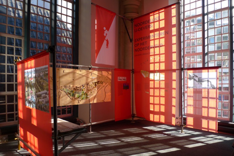
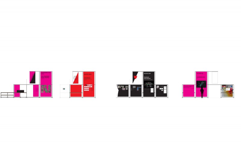
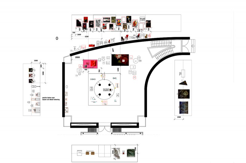
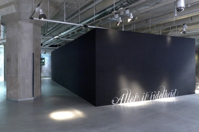
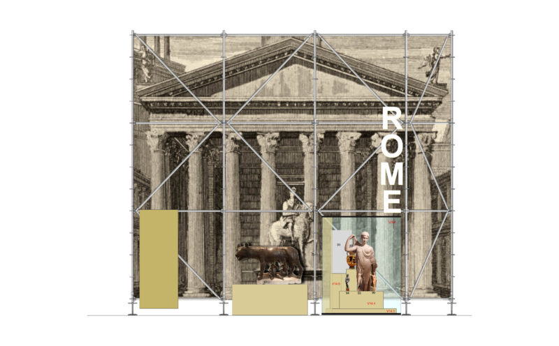
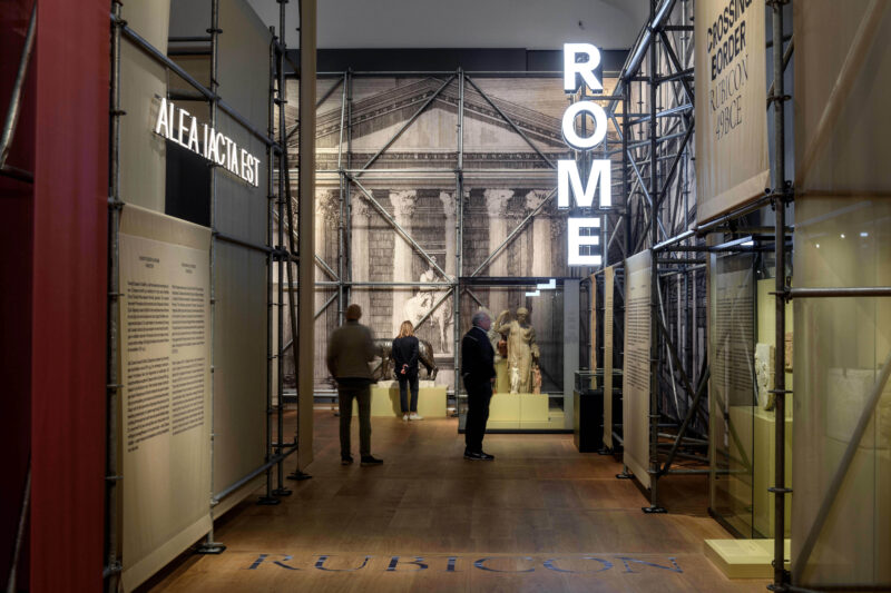
The exhibition design aims to shed a new light on the controversial hero by treating Caesar like a brand, comparable to global products like Coca-Cola. The use of advertisement aesthetics with scaffolding, banners, blow-ups and illuminated letters evokes a certain irony and creates distance to the historical subject.

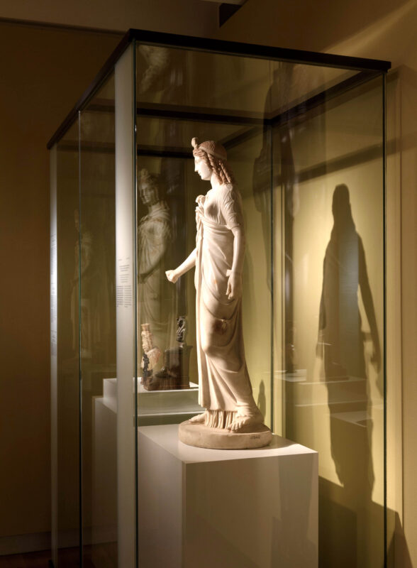
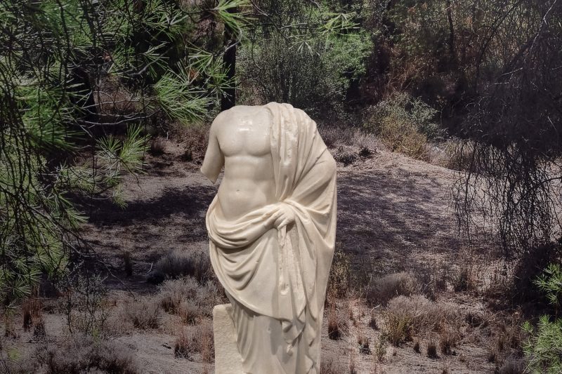
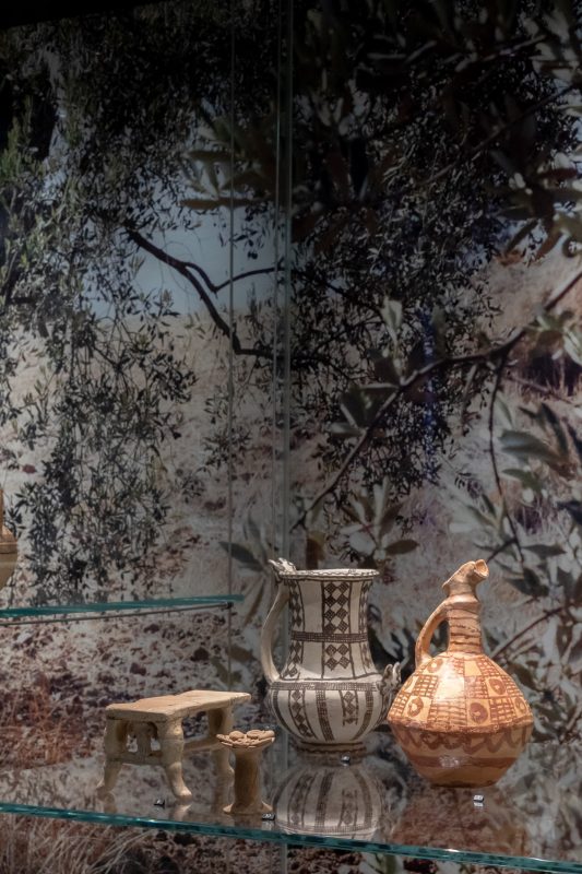
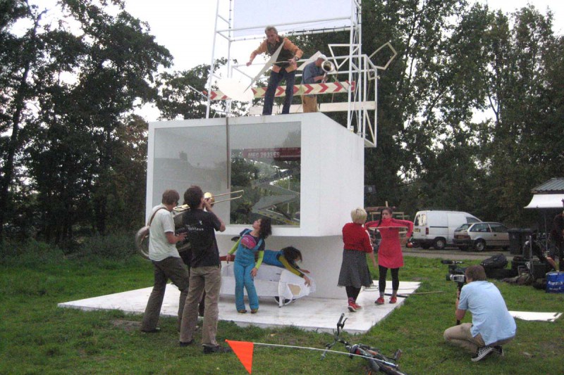
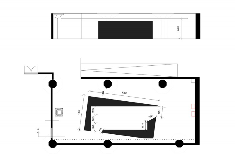
The six-meter-tall theatrical scenery emphasizes the intimidating grandeur of Caesar. The distinct choice of materials and intentional differences in scale reflect the intrinsic contradictions of “Caesar” the brand. Rough metal versus soft banners, contemporary scaffold versus age-old marble statues. This approach invites visitors to form new opinions on a complex historical character.

Graphic design by Glamcult Studio, Marline Bakker – scaffold by Interstage – light letters by welovecolor.nl – banners by PPS Imaging – prints by Riwi Collotype – photography by Mike Bink

cameos – Miniature masterpieces

Cameos are gems carved in relief, showing an image of one colour on a surface of a contrasting colour. As decorative stones in rings, necklaces or earrings, those small pieces of jewellery were very popular in the Roman Empire.

RMO recently acquired a collection of those miniature masterpieces and asked Archetypisch to design a treasury-like room that underlines their uniqueness and exceptionally high quality.

Like the gems themselves, the space is built up in layers of light and dark. White glass panels are framing black showcases displaying the cameos. The panels resemble antique marble but couldn’t be more contemporary: The glass is made of 100% recycled glass waste and can be returned to the glass production cycle after use.

To bring out the relationship between the jewellery and the human body, Archetypisch commissioned Scheltens & Abbenes to make a clip for the exhibition. The models are not from flesh and bones though, it’s the antique sculptures collection of the museum who are the mannequins for the shoot. The bright marble skin carrying the luxurious jewels creates the ambiance of ultimate beauty and glamour.

Spatial design & film concept Archetypisch | Graphic design Esther de Vries | Film Scheltens & Abbenes | Light Chris Pype | Construction Fiction factory | Showcases Glascom | Installation AV Technodesk | Glass panels Magna Glaskeramik | Prints Riwi Collotype

Photography Mike Bink

November 2022

Byblos – The World’s Most Ancient Port

Client: Dutch National Museum of Antiquities, Leiden

Project: Spatial design for temporary exhibition

Byblos is a major exhibition about the world’s most ancient port in Lebanon. Five hundred objects from the collections of various internationally renowned museums are bearing witness to Byblos’ archaeological and cultural richness. The town situated on the coast of present-day Lebanon played an extraordinary role in the Mediterranean and Middle East from 3000 BC, thanks to the trade in cedar wood. The exposition is designed as a pop-up book, featuring a collection of famous tales from antiquity that took place in or near Byblos. The tales are illustrated by Karst-Janneke Rogaar. Gods and inhabitants of Byblos and the cedar trees are cut-out in life-size and bring the city to life.

Graphic design by Kathrin Hero, illustrations by Karst-Janneke Rogaar

Construction by Koert Verberne en Bouwko Landstra, panel production by Heijmerink Wagemakers

Cedar wood scent by the Snifferoo

Photo 4, 6 and 12  by Kathrin Hero, photographs 7, 9, 11, 13-15, 17 by Arie de Leeuw

October 2022 – March 2023

Books that made history

Client: Dutch National Museum of Antiquities, Leiden

Project: Spatial design for temporary exhibition

A selection of 25 scientific books that influence our lives until today: Galilei, Boerhaave, Linnaeus, Einstein, Doesburg and many more. All books have a strong connection with the academic history of the city of Leiden and its university library. The universal meaning and value of the books is reflected in the exhibition design that treats the objects like jewels: perfectly lit and displayed in a blue surrounding, their appearance and visions still fill us with wonder.

Graphic design: Kathrin Hero

Banners: Riwi Collo Type, book mounts by Bouwko Landstra en Koert Verberne

Photography Mike Bink

In collaboration with UB Leiden

at home with jordaens

Client: Frans Hals Museum, Haarlem

Project: Spatial design for temporary exhibition

Centre piece of the exhibition on the Flemish Baroque painter Jacob Jordaens is the reconstruction of his show room which used to be in his house in Antwerp. For the first time the nine ceiling paintings are shown in Holland in a reconstruction with a temporary twist: Jordaens wanted to overwhelm his clients with a richly decorated room, we added the mirrorfloor for an immersive experience. The mirrorfloor creates a fascinating new perspective on the ceiling paintings and activates visitors immediately to engage with the room and the artworks.

Paintings on loan from Phoebus Foundation, Antwerp

Graphic design by Kathrin Hero, built by Fiction Factory, wall prints by Watjeziet, light by 50lux, art handling by aorta.be

Photography Arie de Leeuw, Anika Ohlerich. last picture Frouke de Leeuw

October 15 2021 – May 8 2022


temples of malta

Client: Dutch National Museum of Antiquities, Leiden

Project: Spatial design for temporary exhibition

The exhibition Temples of Malta presents Malta’s rich prehistoric culture, a world of temples, tombs and mysterious stone figures. We look back to these ancient times (3600-2500 BC) using contemporary high-tech: Robot cameras hovering over the temple models on eye-level create a monumental live projection that gives the impression of walking through the actual sites.

Another live camera zooms in on one of the so called ‘fat ladies’, enlarging her prehistoric face and underlining the universal and timeless quality of human features.

Visual backbone of the exhibition are the wall banners in a color gradient from dark to light red ochre, the pigment found in tombs and on the stone figures.

Concept and spatial design: Archetypisch

Graphic design: Esther de Vries

Robot camera installation: Uif Putters

Graphic production: Riwi Collotype

Colour gradient by Rosa de Kruif

we built this city on rock and roll

Client: Van Eesteren Museum, Amsterdam

Project: Photo compilation and design for temporary exhibition

“We built this city on Rock and roll” shows photographs of the music heroes of the 60/70s shot by Gijsbert Hanekroot, a pioneer of rock music photography.

A black stage creates an extra floor in the museum, offering a whole new perspective on the beautiful pavilion. Climbing up the stairway to heaven, the visitors find themselves eye to eye with David Bowie, Blondie, The Who, Nina Hagen and many more. As the stage is made of rented scaffolding material and the black fabric is being re-used, our design scores high on sustainability.

Graphic design: Cecilia Hendrikx

Sponsored by Patkel, Voordekunst, AFK, VSB fonds

Mounting by Artefact Montage en Tirza Mol

http://vaneesterenmuseum.nl/nl/home/


Cyprus, a dynamic island

Cyprus, A Dynamic Island

Client: Dutch National Museum of Antiquities, Leiden

Project: Spatial design for temporary exhibition

Cyprus was one of the most important hubs of ancient cultures in the Mediterranean. Thanks to its strategic location, the island has been at the centre of constant movements of people, sovereigns, religions and exchanges of goods. This dynamic scenario takes place in front of a background that always stayed the same: the nature of the island, brilliantly captured by the photography of Natascha Libbert. The combination of photography and archeological collection puts the objects in the context where they come from and shows the timeless beauty of Cypriot art.

Graphic design: Kathrin Hero

Photography: Natascha Libbert, Rob Overmeer, Archetypisch

Built by Fiction factory, graphics by Riwi Collo Type, animations Menno Schrap

the courtroom of the future

Client: Rietveld Academy in cooperation with Amsterdam Law School (UvA) and http://lawyersaschangemakers.org

Project: An inter-disciplinary class on “Design of Justice: the courtroom of the future”.

In mixed groups, the students were challenging the current structure of the criminal courtroom, trying to develop the ideal space of justice. The new design concepts lead to more clarity in the court session and facilitate space for consolation and forgiveness, for safety and trust.

On December 7 2018 the concepts were presented in front of a large audience at the Court of Amsterdam.

The photographs (@Archetypisch and @Anneloor van Heemstra) show the student projects.


the girl in the spotlight

Client: Mauritshuis, The Hague

Project: Design of glass enclosure for public examination of Vermeer’s “Girl with a Pearl Earring”

The Mauritshuis invited scientist from all over the world for an in-depth examination of Vermeer’s “Girl with a Pearl Earring”. In a temporary studio the newest scan technology was applied in public for two weeks long to find out more about the materials and the layers of Vermeer’s iconic painting.

The shape of the glass encounter is inspired by historic folding screens. February 26 – March 11 2018

Graphic and interactive design by Yvonne van Versendaal and Ehud Neuhaus. Built by Kloosterboer Decor. Movie by Ivo Hoekstra, photographs by Ivo Hoekstra and Ehud Neuhaus

https://www.mauritshuis.nl/en/discover/exhibitions/the-girl-in-the-spotlight/

Lân fan taal, Leeuwarden 2018

Client: Province of Fryslan

Project: Interior design of the visitor centre Obe, Leeuwarden

Lân fan taal is a free-state for all languages. In the framework of Leeuwarden European Capital of Culture 2018, Lân fan taal offers a podium for all kind of languages, including Frisian, but also slang, Braille, sign and body language, as well as dance, music and poetry. The visitor centre Obe is the portal to Lân fan taal.

The Wall of Languages with his revolving cubes visualizes the inconceivable amount of nearly 7000 living, recognized languages worldwide. Pinpointing your own language on these big walls is a way of defining your position in this world and realizing that your linguistic background is one of thousands of cultures to interact with.


Interior design by Archetypisch. Graphic design by Studio Louter.

Architecture by Powerhouse Company. Neons by Tim Etchells.

Lân fan taal public

Client: Province of Fryslan

Project: Design of the visual identy of Lân fan taal in public space

Lân fan taal is a free-state for all languages: here all languages are equal and language is infinite. Our world is becoming increasingly multilingual and more diverse. That is why Lân fan taal is inviting you to broaden your vision. Discover the importance and meaning of multilingualism through spatial installations and activities at Prinsentuin and Oldehoofsterkerkhof in Leeuwarden.

Concept: Archetypisch & Studio Louter. Spatial design: Archetypisch. Graphic and interactive design: Studio Louter.

persepolis

Fascination with Persepolis

Client: Dutch National Museum of Antiquities, Leiden

Project: Spatial and graphic design for temporary exhibition

From the fourteenth century on European travellers, photographers and scholars made the long journey to present-day Iran to visit Persepolis, one of the most fascinating archaeological sites in the ancient world. The exhibition shows their impressions captured in drawings, photographs and writings, based on the book by Corien Vuurman. 2017

http://www.rmo.nl/english/exhibitions/fascination-with-persepolis

slow food

Client: Mauritshuis, The Hague

Project: Exhibition design of SLOW FOOD, Still Lifes of the Golden Age. The color scheme is inspired by the colors of an artichoke: from darker to lighter green to pink-purple in the heart. The earlier still lifes are hanging on the shades of green, whereas the late monochrome paintings are displayed on purple. The exhibition walls in various heights create intimate cabinets where visitors can zoom in on all the delicacies. The exhibition guide provides deeper information and includes an ingredient list!

March 9 – June 25 2017

Graphic design Kathrin Hero

Construction Fiction Factory, Amsterdam
Lighting Advisor Hans Wolff & Partners, Amsterdam
Print Exhibition Rijnja, Amsterdam
Print Guides Pantheon drukkers, Velsen-Noord

Photography Ivo Hoekstra

MODERNISING MODERNISM

Transforming public space of Amsterdam New West

Clients: Rietveld Academy in cooperation with Van Eesterenmuseum

Project: Students from the department of Inter-Architecture of the Rietveld Academy reflect on the public space of the Western Garden Cities. This modernist area has been planned by Van Eesteren in 1934 (AUP), has been built after World War II and is inhabited by people of today. The students developed new concepts for public space during the urban design course I’ve been teaching in the winter semester 2015. The projects offer new perspectives, new experiences and new services for Amsterdam New West.

The student design projects are exhibited at the Van Eesterenmuseum from April 1 until June 26 2016.

www.inter-architecture.nl

www.vaneesterenmuseum.nl

bible foundation

BIBLE FOUNDATION

Client: Gereformeerde Bijbelstichting/Reformed Bible Foundation, Leerdam

Project: Exhibition design of permanent collection of the foundation.

A walk through the history of bible translations displaying the impressive bible collection from 1477 until today. 2016.

In association with www.museummind.nl

Book supports by Mark de Graaff  http://artefactmontage.nl/

water treasure

WATER TREASURE

Client: Hoogheemraadschap Hollands Noorderkwartier regional water board

Project: Exhibition design of permanent collection for water board in its new office building in Heerhugowaard. 2011

This exhibition emphasizes contrasts within the collection, with fine crystal glasses used by directors placed alongside rough tools for building dikes. Such objects symbolize the inner and outer worlds of the institution in its centuries-old struggle against the water.

In association with suopulab.nl

Object mounting by Mark de Graaff  http://artefactmontage.nl/

ATELIER MALKOVICH

ATELIER MALKOVICH

Client: The Nieuw en Meer – Amsterdam artist studio complex

Project: Competition to design the artist studio of the future.

Archetypisch and Suopulab won the Atelier Malkovich competition with their proposal for artist studios at the Nieuwe Meer, Amsterdam. Called PARKPARK, the studio design was part of an exhibition of experimental architecture that features eight pavilions built at half scale. The design was presented at the Nieuw en Meer artist studio complex in the summer of 2008.

In association with www.suopulab.nl

www.nieuwenmeer.nl/Malkovich

Foto 3 Thomas Lenden

INTERNATIONAL PUBLIC SPACE

INTERNATIONAL PUBLIC SPACE

Client: Gerrit Rietveld Academy, Department of Inter-Architecture

Project: A week-long workshop for first and second year students on ‘culturally specific design’. 2013

Students observed the behaviour of people from different cultural backgrounds in the city to see whether it reflects a particular way of using public space. Drawing on the research findings, they then designed an intervention in public space that accentuates certain culture-based behaviour. The photographs show the student projects.

For more lessons on public space see http://inter-architecture.rietveldacademie.nl/?page_id=7532


BREDERODE CASTLE

BREDERODE CASTLE

Client: Rijksgebouwendienst/Government Buildings Agency, Cultural Heritage of North Holland

Project: Design of information system that updates visitors on the castle’s renovation. 2010

A system of boards and weathering steel installations enables passers-by to zoom in on all kinds of details about the renovation process, such as the type of bricks and plaster used, the treatment of vegetation, or the bats living in the castle walls.

In association with Yvonne van Versendaal and Madelinde Hageman

DUTCH DOC AWARD

DUTCH DOC AWARD

Client: Dutch Doc Photo Foundation/Tropenmuseum Amsterdam

Project: Exhibition design for Dutch Doc Award, a biennial prize for documentary photography, that presented work by the 6 nominees in 2013. The design, featuring a colour gradation on the walls from white to dark grey, was enhanced by a light installation made up of a cloud of neon tubes that vary in light intensity.

In association with SuopuLab and Yvonne van Versendaal

www.dutch-doc.nl

PUBLIC SPACE IN CHINA

PUBLIC SPACE IN CHINA

Study tours to explore the use of public space in China. I travelled to schools and universities in Shanghai, Hefei, Wuhan, Taihe, Jinan and Jincheng, lecturing about codes of behaviour in Western and Eastern cities.

In November 2011, I was a guest tutor at the School of Architecture at the Central Academy of Fine Arts in Beijing.

www.archetypisch.nl/blog


VRIJSTAAT AMSTERDAM

THE MAKING OF VRIJSTAAT AMSTERDAM

Client: Zuiderkerk Information Centre, Amsterdam

Project: Design and production of exhibition. 2009

Within the framework of the 4th International Architecture Biennial Rotterdam/Amsterdam, nine young urban design offices developed proposals for nine metropolitan locations in Amsterdam. The Zuiderkerk in Amsterdam presented studies, sketches and models of these ‘spaces for freedom and change’ in an exhibition landscape composed of scaffolding and fabric.

In association with Yvonne van Versendaal www.yv2.nl

http://iabr.nl/nl/editie/open-city-designing-coexistence

A BEAUTIFUL THING

A BEAUTIFUL THING

Client: Museum Hilversum

Project: Design of the exhibition “Een mooi ding/A Beautiful Thing”. 2010

This exhibition on design and craftsmanship in Holland from 1890 to 2010 presented the full spectrum of Dutch design creativity, varying from unique pieces to objects of mass production. The objects were not displayed chronologically but in groups according to type. Instead of small captions, each item featured a detailed label with information about the designer, material, technique, manufacture, edition, purchaser, etc.

In association with www.suopulab.nl

800 METER COETZEE

800 METER COETZEE

Client: De Balie, Amsterdam

Project: Spatial installation for Coetzee Festival in 2010.

To mark the 70th birthday of Nobel Prize winner J.M. Coetzee, the Balie cultural centre organized a festival in honour of the celebrated South African writer. In the installation designed by Archetypisch and SuopuLab, every line of Summertime, Coetzee’s latest novel, was cut out and glued together. His 297-page book became an 800-metre-long strip that meandered through the spaces of the Balie.

In association with www.suopulab.nl


GOOI WOMEN IN ART

GOOI WOMEN IN ART

Client: Museum Hilversum

Project: Concept and design of exhibition featuring the work of 41 female artists living in the Gooi region during the period 1850-2010.

To turn this eclectic selection of art into a coherent show, Archetypisch and SuopuLab displayed the works according to colour. All paintings, photographs and prints that make up a century of female art in the Gooi region were strictly arranged according to their chief colour. The tonal gradation generated interesting connections and associations between the various artworks.

In association with www.SuopuLab.nl


PAL PENTHOUSE

PAL PENTHOUSE

Client: Pal West
/YD young designers

Project: A two-month design workshop for teenagers to develop their ideas about living, home and furniture. The results were shown in a spectacular theatre show with a revolving stage.

Location: Garage Notweg, Osdorp, Amsterdam. 2010

WWW.PALPENTHOUSE.BLOGSPOT.COM


ZOMERDIJKSTRAATATELIERS

ZOMERDIJKSTRAATATELIERS 1934-2010

Client: Arti et Amicitiae artists association, Amsterdam

Project: Exhibition design. 2010

Exhibition that documents the first studio apartments for artists in Amsterdam, built in 1934 by the architects Zanstra, Giesen and Sijmons. A 1:5 model of the apartment complex was installed at Arti et Amicitiae. Back projections brought the studios to life and illuminated the action and interaction inside the building.

In association with Yvonne van Versendaal

www.arti.nl


MUSEUM QUARTER

MUSEUM QUARTER 1891-2010

Client: City of Amsterdam

Project: Exhibition design for Museum District, Amsterdam. 2008/2009

Past and future designs for Museum Square were displayed in clouds of mobiles all over the Zuiderkerk in Amsterdam. An ephemeral and dynamic installation that conveyed the development of the cultural heart of Amsterdam.

In association with www.suopulab.nl


ALL IS VANITY

ALL IS VANITY

Client: Nederlands Fotomuseum Rotterdam

Project: Design of exhibition about daguerreotypes. 2009

The daguerreotype, the earliest type of photograph, was invented by Louis Daguerre in 1839. The image is exposed directly onto a mirror-polished surface of silver. To create an intimate setting for these small artefacts, SuopuLab and Archetypisch built a black box made up of showcases fitted with glass-fibre lighting.

In association with www.suopulab.nl

www.daguerreobase.org/


THE CITY AS STAGE

THE CITY AS STAGE

Client: Institut für Raumgestaltung, Graz University of Technology, Austria

Project: A workshop for architecture students. 2007

Theme: The city as stage. The influence of architecture on perception and codes of behaviour in public space.

The photographs show models of the student projects.

www.raumgestaltung.tugraz.at/lehrangebot/workshop2.htm

SEE AND BE SEEN

SEE AND BE SEEN

Project: Graduation project, Gerrit Rietveld Academy

Theme: Confrontational public furniture. 2004

This design for seating in a public place makes people more aware of themselves in relation to the others. The nine chairs are set at equal distances from each other, are neutral in form, and appear normal in their use. It is only when one wants to sit down that one realizes that the seat backs unfold in various directions, fixing previously unexpected orientations and views. The sitter cannot know in advance who they will look at or who will look at them.


BENEVOLENT MANOEUVRES

BENEVOLENT MANOEUVRES

Client: Architectenbureau K2, Amsterdam

Project: Design of exhibition with work by K2 at Salon Blauraum, Hamburg, Germany. 2003

The exhibition at the Salon Blauraum architecture gallery shows the work of K2, with a focus on their splendid architectural models. A moveable ladder placed in front of the window display offers additional information.

www.architectenbureau-k2.nl


Archetypisch

Archetypisch is a studio for spatial design founded by Anika Ohlerich in 2007. Archetypisch specializes in exhibitions, ranging from temporary presentations on photography, history, design, urban planning and fine arts to permanent collections.

Archetypisch also focuses on public space. Anika Ohlerich studies how people use the city and how space influences people. She researches behavioural patterns in cities in the Netherlands and elsewhere, especially in relation to spatial interventions in existing structures.

Furthermore, Anika Ohlerich is a lecturer at the Reinwardt Academy, Amsterdam and is a frequent guest teacher at other universities and institutes. She has been teaching for 7 years at the Department of Architectural Design at the Gerrit Rietveld Academy, Amsterdam (2011-1018).

Anika by Tim Stet

Anika Ohlerich is an art historian and spatial designer.

She graduated in 2004 with a Bachelor’s degree in Architectural design from the Gerrit Rietveld Academy in Amsterdam. Prior to that she received a Master of Art in Art History and Theatre Studies from the University of Cologne.

After working for Opera Amsterdam design agency in 2005/2006, she founded Archetypisch in 2007. Archetypisch is a studio for spatial design that specializes in exhibitions and installations in public space.

Photo by Tim Stet

bno_label_NL_zwart

Anika Ohlerich works/has worked for:

  • Rijksmuseum van Oudheden/National Museum of Antiquities, Leiden
  • Frans Hals Museum, Haarlem
  • Mauritshuis, the Hague
  • Leeuwarden European Capital of Culture 2018
  • Van Eesterenmuseum, Amsterdam
  • Architectenbureau Jowa, Amsterdam
  • Tropenmuseum Amsterdam/Dutch Documentary Photo Foundation
  • Congregatie van de Zusters van Julie Postel, Boxmeer
  • The International Architecture Biennale Rotterdam 2012
  • Hoogheemraadschap Hollands Noorderkwartier
  • De Balie, Amsterdam
  • Ministerie van VROM, Rijksgebouwendienst/The Government Buildings Agency Cultureel Erfgoed Noordholland
  • Museum Hilversum
  • Nederlands Fotomuseum, Rotterdam
  • Dienst Ruimtelijke Ordening/Department of Urban Planning and Sustainability, Amsterdam
  • Informatiecentrum Zuiderkerk, Amsterdam
  • Perspekt Studio’s, Haarlem
  • Opera Amsterdam
  • Totems Communication, Amsterdam
  • Bureau Parkstad, Amsterdam
  • Architectenbureau K2, Amsterdam
  • Annet Gelink Gallery, Amsterdam
  • SK Stiftung Kultur, video dance department, Cologne, Germany

Anika Ohlerich lectures/has lectured at:

  • Academy of Architecture, Amsterdam
  • Reinwardt Academy, Amsterdam
  • Gerrit Rietveld Academy, Amsterdam
  • Willem de Kooning Academy, Rotterdam
  • Hogeschool voor de Kunsten Utrecht
  • Academie van Bouwkunst, Groningen
  • Central Academy of Fine Arts, Beijing, China
  • Wuhan University and other universities in China
  • Institut für Raumgestaltung, Technische Universität Graz, Austria

Contact

archetypisch map

ARCHETYPISCH

Anika Ohlerich

Nieuwendammerdijk 532a

NL-1023BX Amsterdam

anika@archetypisch.nl
+31 6 24 15 24 97